The Laayo name, logo and colours
What the Laayo wordmark looks like, how to write the name, which colours belong to the brand and how the logo should and should not be used.

This page explains the Laayo brand in plain words: how to write the name, what the logo looks like, which colours we use and where to get the official files. If you are a partner, a journalist or simply curious, this is the reference.
How to write the name#
The name is Laayo: capital L, then “aayo”, one word. Please do not write it as “LAAYO”, “La Ayo” or “Laayo App”. When you need to be precise about the company, use Laayo Services Pvt. Ltd.
Our products follow the same pattern: Laayo Plus, Laayo Biz and Qora by Laayo.
The wordmark#
Laayo’s logo is a wordmark, a logo made of the name itself. It has two parts:
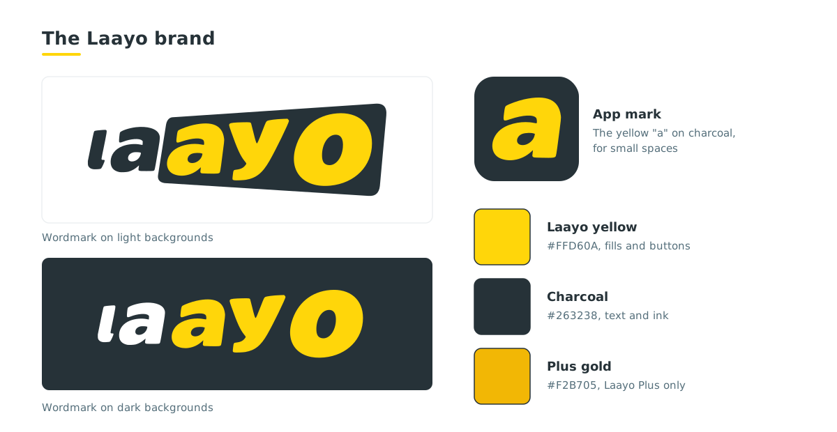
- ”la” written in charcoal.
- A slanted charcoal badge that holds ”ayo” in Laayo yellow.
The slant gives the mark a sense of movement, which suits a delivery service. The badge makes the logo recognisable even when it is small.
Laayo adopted this wordmark in late September 2026. It replaced an earlier picture logo everywhere: the apps, the websites, emails and documents issued since then.
The app mark#
Where the full wordmark would be too small, such as a browser tab, we use a compact mark: the yellow “a” from the badge on a charcoal rounded square. Phone launcher icons use the full wordmark on yellow, because a home screen has room for it.
Laayo Plus has its own icon variant: the wordmark on Plus gold with a small crown, so members can tell it apart.
Colours#
Laayo has two main colours and a small supporting set:
| Colour | Hex | Used for |
|---|---|---|
| Laayo yellow | #FFD60A | Buttons, highlights, the badge in the logo |
| Charcoal | #263238 | Text, the “la” in the logo, dark backgrounds |
| Plus gold | #F2B705 | Laayo Plus only |
Red is not a Laayo brand colour. We use it only for warnings, errors and “closed”. The thinking behind this is in Designing Laayo in yellow.
One rule matters more than the rest: yellow is a fill colour, not a text colour. Yellow text on a white background is hard to read, so we always put charcoal text on yellow, never yellow text on white.
Typeface#
Laayo’s apps and websites use Lexend, an open-licence typeface designed for easy reading. It is friendly, clear at small sizes and works well for both English and numbers on receipts and menus.
Using the Laayo logo#
If you are a restaurant partner, a journalist or an event organiser, you are welcome to use the Laayo wordmark to refer to Laayo. A few simple rules:
- Use the official files from our Investors page, not a screenshot.
- Use the light background version on white and light colours and the dark background version on dark colours.
- Do not stretch, recolour, rotate or add effects such as shadows and glows.
- Leave clear space around the logo so it can breathe.
- Do not use the logo in a way that suggests Laayo endorses something it does not.
For anything beyond this, write to us through the Investors page form and choose “Press and media”.
Quick answers#
What does the Laayo logo look like?#
It is a wordmark: “la” in charcoal next to a slanted charcoal badge with “ayo” in yellow. The compact app mark is the yellow “a” on a charcoal rounded square.
What are Laayo’s brand colours?#
Laayo yellow (#FFD60A) and charcoal (#263238). Plus gold (#F2B705) is used only for Laayo Plus.
When did Laayo change its logo?#
Laayo adopted its current wordmark in late September 2026.
Which font does Laayo use?#
Laayo uses Lexend, an open-licence typeface designed for readability.
Where can I download the Laayo logo?#
The official wordmark files, for light and dark backgrounds, are linked under Brand assets on the Investors page of this blog.


